Catering to sophisticated money.
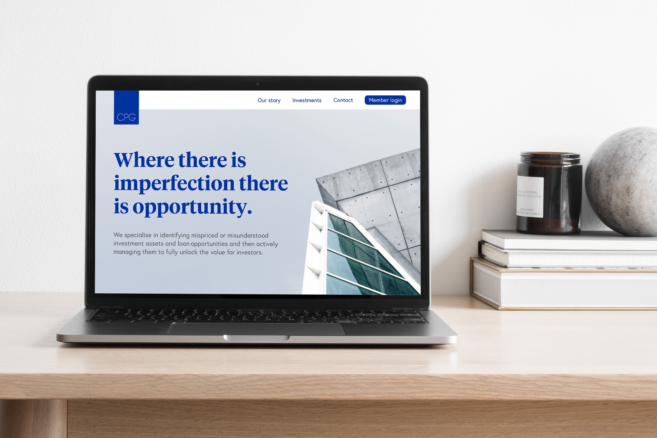
Centennial Property Group (CPG) is boutique property investment manager that strategically targets property assets with significant value-add opportunities. In short, they unlock the value of imperfect.
CPG is like a members-only club. Once you’re in, you get first dibs on future investments. They don’t cater to the mass-market or youth, instead their clients are sophisticated and wealthy.
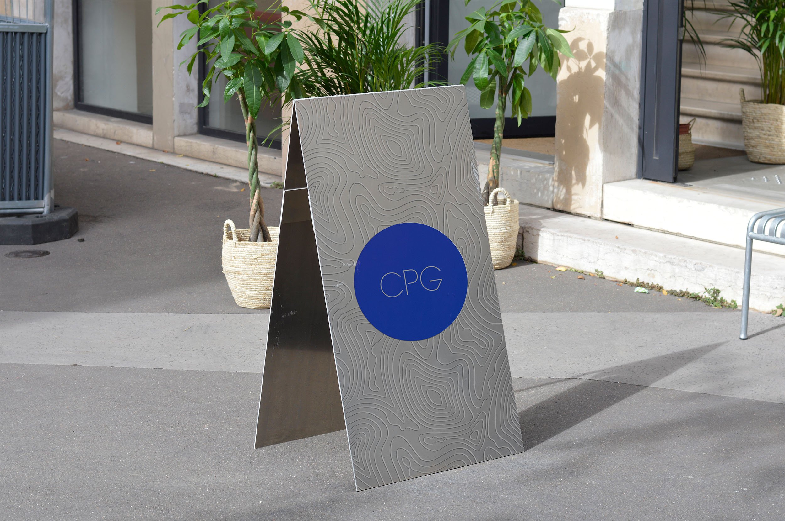
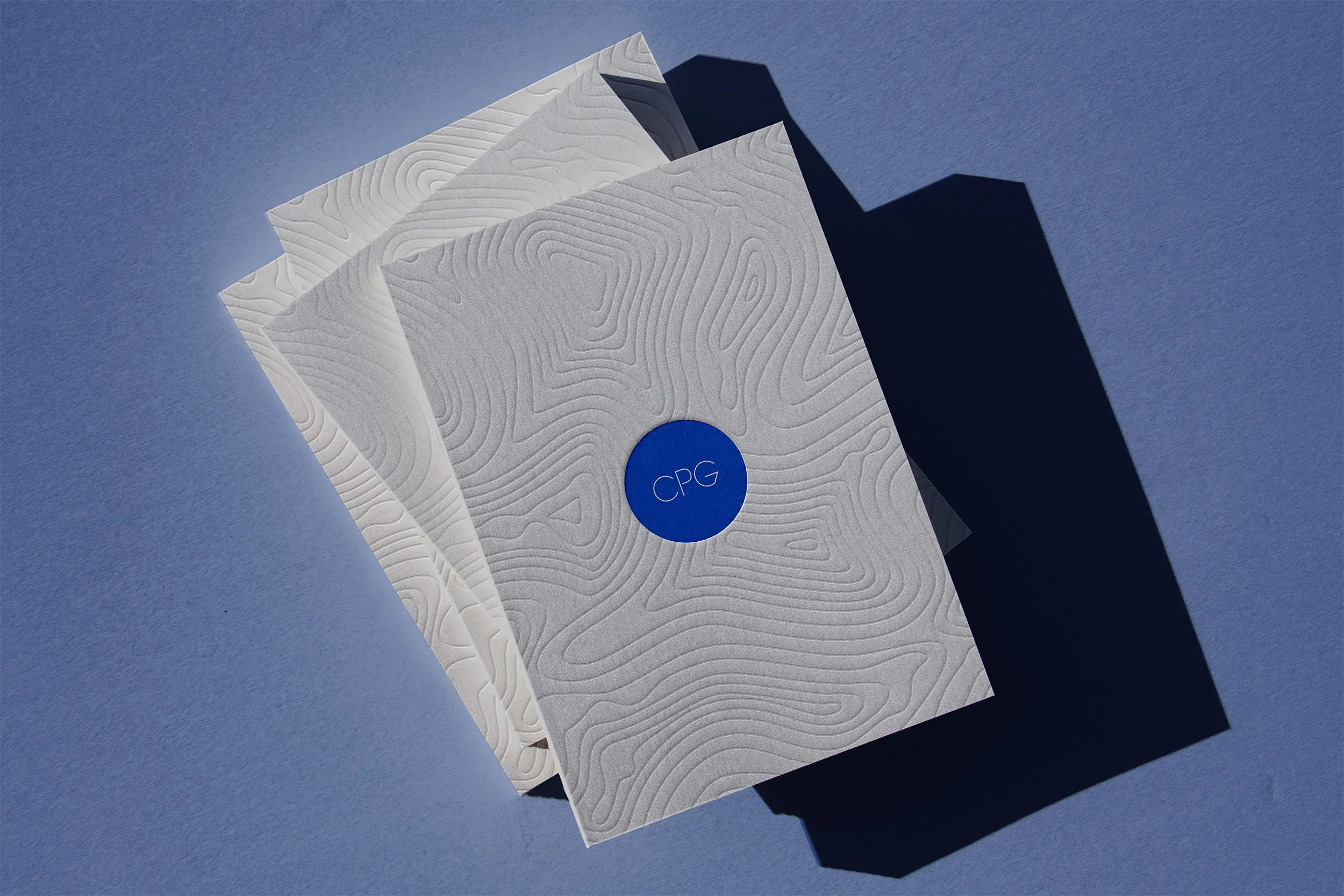
CPG approached me to for a brand refresh. They wanted to retain their logo and main brand colour (blue), but overhaul everything else. As they are predominantly talking to existing clients who trust them, the solution I came up with is quiet. There is no need for the brand to shout or stand out. Instead the sophistication lies in the details, using imagery relevant to property development including topographic lines, materials and finishes to create a subtle, textured palette.


